Tuesday, September 7, 2010

Fall Week 1: Preparing Data for GIS & Public Health


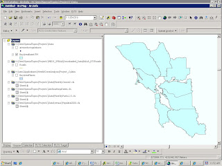
In this first 3-week section, we will be producing maps of Bay Area demographics as well as asthma hospitalization rates and some pollution indices. As part of the preparation, we had to compile a metadata chart containing the layers we would need to use. I can't for the life of me figure out how to link it to this, so instead here (to the left) is a screen shot of the layers I plan to use; below is a link to the same thing, only bigger.
I haven't included anything in this screenshot other than the outlines of the Bay Area counties. I'm still having some problems, with a) having a correct, or complete, roads file - although the roads aren't crucial for the public health part, I think, so far; and b) with the correct projection for the air sampling stations, which so far has eluded me. Maybe by next week...
Friday, July 23, 2010

Week 5: Using LiDAR


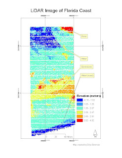
This week we learned how to import a .txt file of raw LiDAR point data into ArcMap, convert the data into a raster image in ArcMap and transfer that image back into ERDAS. This wasn't so hard; the difficult parts for me in the challenge part of the lab were
a) figuring out the scale (until I read the .xml metadata file and realized what the projection was I kept getting impossibly small figures for the scale),
b) wondering where on earth I was - when I was still confused about the scale I did discover - by checking the coordinates into Google Earth - that the location must be the Florida coast again and not in the middle of Iran as I thought for a perplexed moment! - and
c) 'reading' the raster image to figure out which was road and which was sand dune. The road, I concluded, was the part at the top right (it shows up in red in this image) with fairly uniform elevation and a longish straight side, but it took a while before my different classifications showed that. I think I got it eventually - it was initially hard to see. With the manual classification I did (I chose not to use a "stretched" continuum of color) I found it easier to find the road. I ended up creating a rather luridly colored image but water shows up clearly, here as blue (because the elevation is near zero) and sand dunes are yellow and orange. The whole process did reinforce for me what a rube I am when it comes to remote sensing. If only I'd taken a full semester of it when I had the opportunity!

Saturday, July 17, 2010

Week 4: Supervised Classification

Here is a link to the map that resulted from this week's lab: http://students.uwf.edu/db27/RemoteSensg/Week4.xps
I'm finding RS really interesting even though the software is dismayingly unfriendly to the user (but powerful). This week we classified land cover types from a satellite image, and then recoded some of the land cover types (merging classes to make fewer classes). I had trouble with recoding in the challenge lab although it seemed to go OK in the main lab. Still have questions about the mechanics of this - remote labs are OK but the discussion board for questions works only so far. I'm finding ERDAS to be a sort of Frankensteiny monster - powerful but lurching from side to side unpredictably (not to mention crashing without warning) and so far it's awfullly hard to get it to do what I want. More practice would help. I wish I'd taken remote sensing when I did my geography degree and was actually present in person!

Monday, July 12, 2010

Week 3: Orthorectification

This week we placed control points on images and tried to orthorectify the images by making reference to a topo map (or, in the first part of the lab, to specific points on an image). This was an interesting experience that I was able to repeat many times because of the program crashing repeatedly. I understand the general idea but I had a lot of problems with the software, which makes ArcGIS look like a walk in the park.
The final image is the orthorectified one, with a UTM map grid superimposed. I am not sure whether it is clear that the final image has been orthorectified. I think the software does a lot of useful things, but it currently has some built-in frustrations.
A link to my orthorectified image is at http://students.uwf.edu/db27/RemoteSensg/Week3PensaRectify.xps

Thursday, July 1, 2010

Week2: Discerning Differences Using Spectral Bands

This week we looked at an image taken near Puget Sound, Washington and examined the image information, including the pixel histogram and the pixel data, for specific places in the image where pixel values in certain bands were particularly low or high. I still find ERDAS Imagine a frustrating and non-intuitive form of software, but in looking at the image using different wavelength bands I was captivated by the scope for interpretation and visualization. This made it a really interesting lab (when I was not cursing ERDAS). I still have no idea where Map Composer is or whether it (or its logo) even exists within the software, but I did eventually find all the pieces of things I needed to finish the lab.
Links to my images:
http://students.uwf.edu/db27/RemoteSensg/Week2Layout1.xps
http://students.uwf.edu/db27/RemoteSensg/Week2Layout2.xpshttp://students.uwf.edu/db27/RemoteSensg/Week2Layout3.xps

Monday, June 28, 2010

Week 7: Location Decisions, Our Choice


Not sure if a blog is required this week so am forging away. This week required the same work as last week, but the criteria and the location were our choice. I briefly considered Durham, NC, but I can't easily get the shapefiles I would like - FGDL.org has a better centralized shapefile inventory than the NC equivalent or than what I could get from Durham. I chose Leon County, NC, largely because it had an interesting rail-trail and a university, Florida State, in Tallahassee. I wanted a location that was close to libraries, to FSU, and to the rail-trail, but also with high median house values.


This provided an interesting conflict because central Tallahassee has low house values (and correspondingly high poverty levels), although this area is close to the uni and near public libraries and the trail. So the result is a tradeoff: which is more desirable: high house values, or the amenities that make life worth living?


I've attached my poster, or at least what I think is a poster, detailing the process and the outcomes.

Saturday, June 26, 2010

Remote Sensing: Week 1 maphttp://students.uwf.edu/db27/Pensacola1.xps

http://students.uwf.edu/db27/Pensacola1.xps
The map to which this link should direct you is my first map in ERDAS (ERDAS IMAGINE 2010, which looks like the latest Windows interface, alas). It was an interesting - perhaps frustrating would be a better word - experience, but at least it was a learning experience. I'd like to know more about in what way ERDAS is better suited to displaying aerial photographs, etc. than ArcGIS (after all that time I have spent making sense of ArcGIS!) I hope it will get easier with practice.