Tuesday, November 23, 2010

Project 4 Week 3: Finding Optimal Routes for Wine Delivery


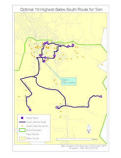
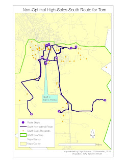
This week we looked at the same three wine sales territories in Napa County and used Network Analyst to find the best route - NA can do this by time, using a field for speed limit for each road segment, or by miles, which is how we did it - for a sales representative in each territory, starting from the sales rep's home. For this particular exercise we selected the top 10 sales in each territory, created a list of sales stops from these 10 (using Network Analyst), and then created a route, again using Network Analyst, that takes the sales rep from the home starting point to all the 10 stops.
Interestingly, the default route is based on the number of the OBJECTID field in the sales prospects attribute table, rather than any other geographically-related field, so this route is likely to be a) long and b) nonsensical: for an entertaining example of this, see the map on the right (the Non-Optimal one for the South territory). If you look closely at the numbers to see the order of stops, you can see how little sense it makes.


As I mentioned above, however, Network Analyst does have a setting that allows you to create an "optimal" route, in this example the one with the smallest number of miles to cover: see the map on the left. It also allows you to print out a set of directions from to get you from designated stop to designated stop. You will note though that many stops near the 10-highest-sales ones are not included in this example. Left unaddressed is who is going to trail along and pick up the slack using another, less lucrative route!


We could have symbolized the roads in these maps according to the prevailing format - freeways in 3.4 width red, lesser highways in black with the usual symbol, etc. - but the important thing in this map is really the route the sales rep is supposed to follow. Hence I chose to leave the non-route routes in pale grey regardless of their size, and the route roads are the only ones I labeled since they are the ones that the sales rep is looking for. If I were the sales rep I would also throw a good, large-scale county map into the car/truck, just as insurance: ArcGIS directions are only as good as the data, and we know that Google directions, which are generally pretty good and which probably come from very similar data, can slip up royally from time to time.

Related to this is the fact that one of the sales stops on the original map for the Northeast territory could not be located by Network Analyst. It appears that the road on which it sits does exist, but it wasn't in the road network dataset that we used. So the stop was located correctly, but Network Analyst couldn't figure out how to get there because it couldn't see the road. I tried to move the sales stop point to the nearest road, but ran into immediate difficulties as when I reran the route calculations, nearly half of the sales spots showed up as not located. So I took the easy route, so to speak, and dropped the problematic sales stop in favor of the one next on the sales list. If I had a bit more familiarity with NA I expect I could have fixed this, but Project 5 is looming and it's Tuesday already.

Tuesday, November 16, 2010

Project 4 Week 2: Assigning Delivery Areas for Wine Customers


This week we had to divide Napa County into three parts. three ways. First we divided the number of wine customers (290) and their sales. The first slicing of the county (no name attached) was by number of customers and sales: each third on the map had to include 95-97 customers and 1/3 of the total county wine sales, +-5%. The next, called Territory 1, was just a straight geographic division, using straight lines (they all intersected near the densely-populated south-central portion of hte county. The final slicing (called Territory 2) attempted to divide the county using roads as the boundaries, preferably major roads. I had to use one minor road for this. A link to the resulting powerpoint is attached: http://students.uwf.edu/db27/BayArea/Week2WineDeliverable.ppt

and above is a graphic just for the sake of decoration: (this is the first one, equal sales and equal numbers of vendors):


One of the interesting things about this was how little tweaking is needed to change the figures considerably and skew the sales over to one section or another, because of the density of stores and restaurants in the south-central region. My territories 1 and 2 didn't do a great job of equalizing customers and sales, although it's clear that it wouldn't be hard to do that. A more thorny issue is that the South area, under the current criteria (number of customers and total sales potential), benefits unfairly because deliveries would take a lot less time given how close the markets are to one another.


I had a fair amount of trouble with this one because I missed a note about the need to edit the "Territory" column (to reapportion areas from Northwest to Northeast, or South to Northwest, or whatever) after each new set of boundaries was created. Eventually I figured that out, but there were a couple of "ghost" points - one because it fell outside the Napa County shapefile boundary line, another for no reason that I could see - that were also confusing. I am getting better at editing things in ArcMap though, which is a relief. This week also did bring home how useful it must be to be competent in programming, to avoid having to do the same thing over and over and over and over...

Monday, November 8, 2010

Project 4, week 1: Wine Sales in Napa County

This project is about transportation routes generally, for wine sales in Napa County, California specifically. We created maps of population (well, numbers of households) as well as of liquor, restaurant and wine sales, with the distribution of restaurant and liquor stores superimposed on these maps.
This was a pretty straightforward week. I look forward to learning a bit more about using Network Analyst - I have created networks in ArcView (pre-ArcGIS) but haven't managed to do anything in 9.0 or later.
The link to the pdf which contains these maps:
http://students.uwf.edu/db27/BayArea/NapaWineMarket.pdf

Monday, November 1, 2010

Week 9: reporting on the best spot for a bookstore

The mechanics of this week were fairly straightforward although the numbers - on which we would hypothetically be deciding to site a bookshop - were rather less so; one could make legitimate arguments for more than one possible location. I recalculated figures for each site using the census blocks that had their centroid within the 1-mile radius around each location. This is something that I really appreciate about GIS, the ability to summon the location-based figures so rapidly. Here's the powerpoint link for the final report:

http://students.uwf.edu/db27/BayArea/FindingANewLocation.ppt

Saturday, October 23, 2010

week 8: choosing a store site in San Francisco


This week we looked at two more ways of defining market area: by the sales figures within a radius around the store, and by drive time to the store. In fact if one was looking at a potential store site in downtown San Francisco, drive time may be less relevant because - especially for something like bookstores, and in a city that is as walkable as San Francisco - probably a significant proportion of buyers are walking to the store. However "drive time" could be altered to walking time without much difficulty.

So far the assignment is pretty straightforward, although I can see that determining the best store site is going to be tricky because each potential site is good in some important areas (e.g. high population growth) but bad in others (e.g. lower household income).

This week two maps were the products. One shows market area measured by drive time and by the proportion of store sales. The other shows the location of potential available stores as well as the location of current competitors.

Wednesday, October 13, 2010

Week 7? Project 3 Prepare: Market Analysis, Site Selection


The multisectioned map above shows the San Francisco area with two storefronts of the hypothetical Better Books business, and various demographic aspects (household income, percent with some college, etc.) of the area. The one-part map on the left shows average house value (for my own interest) but it also indicates a one-mile buffer around each of the stores, which is presumed to be the market area. This week's work was relatively uncomplicated one. In some ways the tables I created (not shown) to go along with the maps were more interesting, because they showed a smaller overall dollar intake from the Steiner market area but a considerably higher average purchase for each Steiner Book Lover customer. Nice to know that it's not always maps that are illuminating.
An unrelated but useful map-related thing I learned this week - for my internship work, not for this - was that cutting down the size of your data can make a big difference. In my case it was the difference between having ArcGIS run and having ArcGIS freeze, so I was pretty thrilled when I finally figured it out. The dataset in question was a huge watershed file. It was a big advance when I realized that even though I could use a definition query to reduce the size of the visible file, that wouldn't stop my freezing problem. Selecting and exporting part of the data file made an astonishing difference. Next time I have big files I hope I remember to spend a small amount of useful time at the beginning to avoid spending a lot of unproductive time later.

Monday, October 11, 2010

Week 6: Saving Energy via Trees


For this , the report week of the landscape design section, we had first to calculate the energy savings produced from planting trees in our study area. This was more a mathematical than a GIS exercise (once we had the proportion of Marin City, or several Marin City neighborhoods) that was covered by trees. For the second part, we had to determine how many trees would be needed to offset the anticipated energy demands of a new Marin City Center (its area outlined in yellow on the map). This was based on a combination of a) the area covered (calculated with GIS), b) the average monthly electricity usage of a commercial building (from a Department of Energy table), c) the annual energy savings produced by one tree (from another table) and d) the previously-calculated (maximum) number of trees that could be put on the site. It is interesting to see how GIS can intersect with this type of work, and also interesting to see how much of the input is tentative, or at least hypothetical - we don't know whether the average tree's energy savings will be the same as our Marin City average tree, for instance. Still, interesting to do.