Monday, March 29, 2010

Week 10: Contour maps


This week we had to draw contour lines - they are for yearly precipitation for the state of Georgia - on a map in Adobe Illustrator. First we had to draw the contour lines by hand, using a paper map that had point data from dozens of spots, about one per county (Georgia, it turns out, has 159 counties). We had to interpolate the point data manually, eyeballing the lines from point to point, in order to create the contour lines. Then we were to transfer the lines from the printed map to the map in Adobe Illustrator.
I thought the process of creating the contour lines was tremendously interesting, as well as a challenge, especially where the data went down and then up and down again - since rainfall inconveniently does not go smoothly in one direction up (or down) across the state. I found myself resorting to a beautiful 1970s book of maps of British Columbia for a better look at how one deals with the ins and outs of contour lines; this in turn reminded me pleasantly that I've been fascinated by maps for a really long time.
As usual, Adobe Illustrator provided its own set of challenges. I had hoped to color the spaces in between the lines, but my technical skills in Illustrator aren't yet up to the job and I gave up after I got the easy parts (the closed loops) done. The map still has problems. I made a mistake somewhere and couldn't correct it: even after selecting every one of the 159 counties and clicking on the "stroke" icon to correct the county outlines, I was unable to get several counties to match the rest exactly in outline color: you can see this at the south end of the state. But it is recognizably Georgia! and the contour lines are there, so that's how it stands.

Wednesday, March 17, 2010

Week 9: Flow Maps


For this week's lab we had to take a world map in ArcGIS, decide on its projection, and transfer the map to Adobe Illustrator to add flow arrows showing the number of people gaining legal permanent residence in the U.S. in 2007 from each continent.
After printing and rejecting several projections, I decided on Buckminster Fuller's icosahedral one (similar to gnomonic apparently) because it preserves shape well and the continents weren't tremendously distorted in size, and because I've always been intrigued by Fuller and this was my first opportunity to use an invention of his! It did however complicate my north arrow positioning, with which ArcMap did not help me. I am afraid that the north arrow in Illustrator is the result of me blindly aiming for the North Pole.
This time I found the Illustrator videos were quite helpful - having the narrator not rush the words made a big difference. As for the data, I separated arrows for Canada from the flow from the rest of North America because they were coming from two different directions. I chose not to include the GIS file of all the individual U.S. states, since I thought they would only clutter a map that does not display which states are the particular destinations of immigrants.

Thursday, March 11, 2010

Dot Density Maps


This week we had to take some Florida population / housing unit / land area data, in Excel calculate housing density (I used housing units per land area rather than per total area) and create a map of housing density, using Adobe Illustrator again.
I ended up creating two maps because we had a lot of confusion about which we should be doing, raw housing unit (or population) data versus density (units per area). I wanted to see how different the maps would look. In the end I haven't really answered this question well because in the density map for some reason I didn't position the dots as randomly as in the housing units map. The dots in the housing units map are also very slightly larger than those in the density map - 0.8 pixels instead of 0.7 pixels each. I had tried selecting all the dots and then transforming them "Each", but when I did this with large transformations the dots moved as well as expanding/contracting, so I haven't really solved this problem. Overall the maps look quite similar in terms of county-to-county relative amounts of dots, despite differing distributions from map to map within the individual counties.
I feel more comfortable with the housing units map, or at least with the idea of mapping raw data with dots rather than density with dots, but I could see mapping density at the county level if the data were census tracts or something finer than county level. I would like to try this exercise out in ArcMap. I haven't yet learned how to make a template (assuming this is possible) in Illustrator, which may be why not all of my map pieces are identical - the north arrow is in a slightly different place in each, for instance.
Other than that and my gradual lessening of alarm while in Illustrator, I learned how to make a north star a la the cartography text, which pleased me.

Tuesday, March 2, 2010

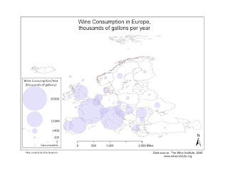
Week 7: using proportional symbols


This week we had to take a simple map of European countries in ArcMap and export it to Adobe Illustrator so we could add proportional symbols in Illustrator. The data came from an Excel file of wine consumption for each country. We had to convert the figures for wine consumption using the formula for representing values via circles (it involves square roots), and represent each country's wine consumption with a circle of the appropriate size.
This went pretty well, a bit to my astonishment but now I have a better idea of how to organize my layers and am a bit more likely to be able to undo unintended errors. In Adobe I did have two peculiar unwanted rectangles that refused to be selected (and hence, to go away), but fortunately they disappeared from the final map when I exported it to a .jpeg. Next time we do something in Adobe Illustrator I'll try making a decent north arrow. If I had more time I'd put the Excel info into ArcMap and see how different that map looked, but I feel pressed for time. I still feel a bit at sea in Illustrator, although I think I can spy land.