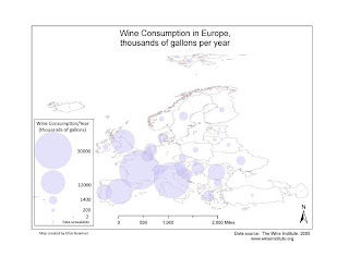
This week we had to take a simple map of European countries in ArcMap and export it to Adobe Illustrator so we could add proportional symbols in Illustrator. The data came from an Excel file of wine consumption for each country. We had to convert the figures for wine consumption using the formula for representing values via circles (it involves square roots), and represent each country's wine consumption with a circle of the appropriate size.
This went pretty well, a bit to my astonishment but now I have a better idea of how to organize my layers and am a bit more likely to be able to undo unintended errors. In Adobe I did have two peculiar unwanted rectangles that refused to be selected (and hence, to go away), but fortunately they disappeared from the final map when I exported it to a .jpeg. Next time we do something in Adobe Illustrator I'll try making a decent north arrow. If I had more time I'd put the Excel info into ArcMap and see how different that map looked, but I feel pressed for time. I still feel a bit at sea in Illustrator, although I think I can spy land.
I like your design and layout, but your map is really missing some color. I found it hard to distinguish between the different countries and the proportional circles.
ReplyDelete