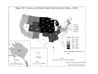
The caption for this map is
State mean SAT scores and SAT participation rates. In general, as a greater proportion of a state's high school graduates take the SAT, the state mean SAT scores fall, and vice versa.
This map was our final project. We were given a link to a table with either ACT scores or SAT scores, and state participation rates. We had to pick SAT or ACT, create the map from the data, and include both scores and state participation rates. I typed the data into an Excel file, joined the Excel file to a state boundary file in ArcMap, and once I had symbolized the mean SAT scores on a choropleth map, exported it as an Adobe Illustrator file so I could position the state participation data as numbers on each state.
Initially I downloaded from the web a free, recent TIGER census state boundary file to join to the SAT data. This worked really well right up until the point in Adobe Illustrator when I was almost finished with adding the participation rates and discovered that Michigan was unrecognizable because the TIGER folk had generalized the state's boundaries to include (i.e. to swallow) Lake Michigan. Concluding that the average newspaper reader would be confused too, I discarded the map and after some unsuccessful web searches, hunted down an ESRI shapefile at my local university's (UNC-Chapel Hill) GIS data depository.
The process for this project was fairly straightforward. I am least pleased with the size of Alaska. I wanted everything to the same scale, and I know it is supposed to be bigger than Texas and California (and a few other states) combined, but I now think the map would have been improved if I had scaled Alaska down a bit to match the size of the rectangle around Hawai'i. I put Hawai'i and Alaska in separate data frames so I could manipulate them into the same layout; I tried to exclude them on the main data frame with a definition query but failed, so I moved the mainland on the screen to remove them instead.
This map is an interesting example of how data left out can mislead. Without the state participation rates, one might understandably assume that for some reason the high school students on the east coast were dullards and those in the midwest and south - except for Texas - were a bright bunch, or at least had better education through high school. Adding participation rates is clearly an improvement, although more information overall would be useful so we might know just who writes the SAT in each state and how they compare with those in other states.
No comments:
Post a Comment