Monday, February 22, 2010

Week 6: Using Adobe Illustrator to make cloropleth maps


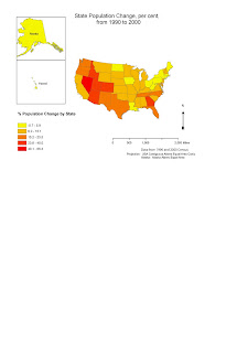
For this week's assignment we first had to create a simple color cloropleth map of population change state by state in the U.S., open the map in Adobe Illustrator and make a few more changes as needed. This went reasonably well until the Illustrator part, although I also had problems with projection because we had to include Hawaii and Alaska on the map. Eventually I put Alaska in a different data frame (and different projection). The map ended up having about three different data frames and I had trouble arranging them all.
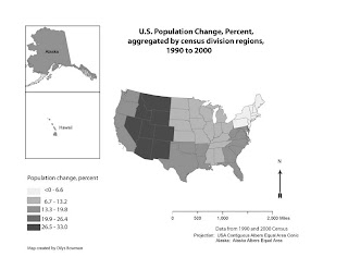
For the second, grayscale, map, we had to open an Excel file of the 1990 and 2000 population figures for each state, calculate the percent change in population for each state, and aggregate the data into averages for each of the regional census divisions (there are 9 of these). The range of values for this second map had to be categorized on an equal interval scale, unlike the color map (map #1), the data for which was categorized according to natural breaks. Then we had to open the first map in Adobe Illustrator, convert the colors for each state to grayscale, and assign the correct color on the grayscale scale to each state, according to where it sat in the census division region. This tinkering also included redoing the numbers for the legend. This wasn't quite as bad as I thought it wuold be, as I am now figuring out how to organize layers and objects in Illustrator, more or less.
Only map #2 (grayscale) is in landscape format, but #1 will have to stay in portrait orientation for now, as I only managed to save the file for #1 in the right format when I was halfway through the changes to the map to make it into #2!

Monday, February 15, 2010

Week 5: South/Central Florida's Hispanic Population, in Adobe Illustrator


This week's assignment was to take a ready-made map in Adobe Illustrator and rearrange the items so that the information was displayed better. We also had to add a north arrow and a neatline. You can see the original on the far left; the one on the right is mine after my changes.

I had a lot of trouble with this assignment and I'm not perfectly satisfied with the end result, though I do think it is an improvement. It took me ages to get the legend in the right place relative to the south/central map of counties. I admit I did not see the videos before getting the map done as I kept getting error messages when I tried (in fact AFTER uploading the final image to this blog I tried one more time and lo and behold, this time the first video worked) - I have been consulting a book on Adobe (and various Help messages on their website) .

I removed the extra zeroes that were originally in the legend percent figures, as they are statistically meaningless as well as confusing to the reader. I used the Kuler tool to find a "swatch" of five colors, but I could not find a Kuler swatch that simply went from light to dark and the one that was closest to what I wanted had two reds that I could not distinguish once they were on the map, so I changed one of the colors in the five-color range to make the differences clearer.

I didn't like any of the arrows that Adobe offers - importing a graceful one would be better - so I compromised by thinning one of their arrows once it was on the screen. I couldn't do anything about the scale bar, which looks too big and clumsy - and is now equidistant from the small-scale and the large-scale Florida map - but I had to let it stand. Maybe when I have better skills I'll be able to fix that! In a word - Phew. I'm glad to have this lab over.

Sunday, February 7, 2010

Week 4: Using Adobe Illustrator in labeling a map

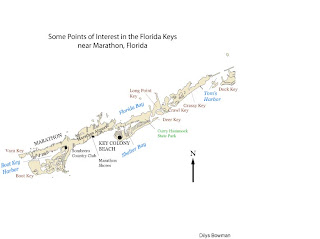
This is my first stab at Adobe Illustrator. The assignment was to label this map of part of the Florida Keys: we were to label four bodies of water, three parks or city features (a country club, a state park and an airport), three cities or towns, and seven islands (keys).

Apart from the frustration of using a new program for the first time and my inability to separate parts of the drawing from other parts (so that I could fill the state park in in green, which you see I have not managed to do), my main dilemma was how to represent things. In particular, the map is absent a legend because there is essentially nothing symbolized. I fear this may come back to haunt me. I did choose to represent the labels with different colors to separate park from water body from island(key).

I have the feeling that there's a lot about Adobe Illustrator that would be very useful, though I don't feel competent enough to enjoy its capacities yet.