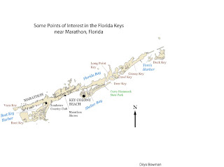
 This is my first stab at Adobe Illustrator. The assignment was to label this map of part of the Florida Keys: we were to label four bodies of water, three parks or city features (a country club, a state park and an airport), three cities or towns, and seven islands (keys).
Apart from the frustration of using a new program for the first time and my inability to separate parts of the drawing from other parts (so that I could fill the state park in in green, which you see I have not managed to do), my main dilemma was how to represent things. In particular, the map is absent a legend because there is essentially nothing symbolized. I fear this may come back to haunt me. I did choose to represent the labels with different colors to separate park from water body from island(key).
I have the feeling that there's a lot about Adobe Illustrator that would be very useful, though I don't feel competent enough to enjoy its capacities yet.
Nice use of color here. You could have created a legend using color as a guide. Key text could have been placed on the islands themselves to free up some space. Hopefully you understand a little more about text placement.
ReplyDeleteI agree with Trisha. Good job with the colors!
ReplyDelete